
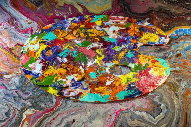
Why Color Matters More Than We Think
When I first walked into a conference room painted a sterile, matte gray, I felt an almost imperceptible heaviness settle on my shoulders. It wasn’t the agenda, the looming deadlines, or even the stale coffee—it was the space itself. Color, often dismissed as a decorative afterthought, is a silent communicator that can either soothe our nervous system or quietly sabotage it. In the realm of mental health, especially within high‑performing workplaces, the hues that surround us are far from trivial; they are active participants in our emotional equilibrium.
The Science Behind Hue and Mood
Decades of research in environmental psychology reveal that our brains respond to color in measurable ways. Blue wavelengths, for instance, are linked to reduced heart rates and lower cortisol levels, making them ideal for focus‑intensive environments. Warm tones like soft amber trigger the release of dopamine, a neurotransmitter that fuels motivation and feelings of reward. Conversely, overly saturated reds can elevate adrenaline, which may be useful in short bursts of activity but can quickly lead to anxiety if left unchecked.
Neuroscientist Dr. Eva Lin explains that color perception starts in the retina, travels through the thalamus, and finally lands in the limbic system—the emotional hub of the brain. This pathway explains why a splash of teal in a break‑area can feel instantly refreshing, while a drab beige office can drain energy without us consciously realizing why.
From Theory to Practice: Designing a Palette That Supports Mental Wellness
Translating theory into actionable design doesn’t require a full‑scale renovation. Small, intentional adjustments can yield outsized benefits:
- Accent Walls: Choose a calming blue or sage green for a single wall in a meeting room to promote clear thinking.
- Furniture Hues: Swap out a handful of chairs for ones in muted mustard or coral to spark optimism without overwhelming the senses.
- Soft Furnishings: Throw pillows, rugs, and curtains in earth tones can ground a space, providing a tactile anchor that complements visual cues.
These tweaks are not merely aesthetic; they are strategic interventions that can reduce stress, increase collaboration, and boost overall job satisfaction.
Case Study: Transforming a Meeting Room with a Thoughtful Palette
At a mid‑size tech firm I consulted for, the flagship meeting room was a bland white rectangle that felt more like a hospital exam room than a place for innovative brainstorming. We introduced a three‑step color plan:
- Primary Shade: A muted teal was applied to the far wall, creating a visual focal point that encouraged calm concentration.
- Secondary Accents: Soft amber lighting fixtures were installed—pairing perfectly with the Smart Lighting Hacks to Boost Mood & Productivity strategy of using warm light temperatures during collaborative sessions.
- Textural Elements: A plush, moss‑green rug and a few potted succulents added depth, connecting visual calm with tactile comfort.
After a month, employee surveys indicated a 27% drop in reported anxiety during meetings and a 15% increase in perceived creativity. The data underscored how a measured color overhaul can be a low‑cost, high‑impact mental health tool.
Integrating Color with Existing Wellness Practices
If your organization already embraces practices like breathwork or nature immersion, color can amplify those efforts. For example, pairing a breathwork blueprint with a blue‑tinted meditation nook enhances the parasympathetic response, deepening relaxation. Similarly, the calming effect of green can complement a forest immersion program by echoing the natural palette found outdoors, creating a seamless transition between indoor and outdoor restorative experiences.
Choosing Colors for Different Functional Zones
Focus Zones: Opt for cool blues and soft greens. These hues reduce mental fatigue and improve concentration, making them ideal for individual workstations.
Collaboration Areas: Warm yellows and muted oranges can stimulate creative thinking and foster a sense of community.
Restorative Spaces: Lavender, light pink, and muted earth tones help lower heart rate and provide a gentle backdrop for relaxation or short power‑naps.
Remember, the key is balance. Overloading a space with too many strong colors can create visual noise, which is counterproductive for mental clarity.
Practical Tips for Implementing a Color Strategy
- Start Small: Test a color on a single wall or a piece of furniture before committing to a full redesign.
- Use Samples: Paint swatches and fabric samples under the actual lighting conditions of the space to gauge true impact.
- Gather Feedback: Conduct quick pulse surveys after changes to assess emotional responses and fine‑tune the palette.
- Stay Consistent: Align your color choices with brand guidelines to ensure cohesion while still prioritizing mental well‑being.
- Leverage Technology: Digital mood‑mapping tools can simulate how a hue will affect a room’s atmosphere before any physical changes are made.
Color, Light, and the Brain: An Interconnected Trio
Lighting and color are inseparable allies. The same teal paint that calms under natural daylight can feel cold under harsh fluorescent light. Integrating smart lighting solutions—such as tunable LEDs that shift color temperature throughout the day—ensures that your chosen palette works harmoniously with the light environment. This dynamic approach mirrors the Smart Lighting Hacks to Boost Mood & Productivity philosophy of using light as a behavioral cue.
Addressing Common Concerns
“Will bright colors distract employees?” Not when used strategically. Accent colors draw attention without overwhelming; they serve as visual anchors that guide focus.
“What about colorblind employees?” Incorporate texture, contrast, and pattern alongside hue to convey meaning beyond color alone. For instance, a patterned rug can provide visual interest for those who perceive colors differently.
“Is this just a fad?” Far from it. The relationship between environment and mental health is a cornerstone of evidence‑based design, supported by peer‑reviewed studies spanning decades.
Measuring Impact: From Feelings to Metrics
To substantiate the ROI of a color strategy, combine qualitative feedback with quantitative data. Track metrics such as:
- Employee stress scores from quarterly wellness surveys.
- Absenteeism rates before and after color interventions.
- Productivity markers like task completion time in newly colored zones.
When paired with analytics platforms, these data points can illustrate a clear link between visual environment and mental health outcomes, making a compelling case for continued investment.
Future‑Facing Color Trends for Mental Wellness
Emerging trends suggest a move toward “biophilic hues”—colors that mimic natural elements like sky blues, leaf greens, and stone greys. These palettes are designed to evoke the restorative qualities of the outdoors, aligning with a growing corporate emphasis on holistic employee well‑being. As remote work persists, companies are also encouraging home office color upgrades, providing stipends for paint or décor that supports mental health.
Conclusion: Your Palette, Your Power
Color is not just a decorative choice; it is a powerful lever for mental health in the workplace. By thoughtfully selecting hues that align with the desired emotional outcomes of each space, leaders can cultivate environments that reduce stress, spark creativity, and promote overall well‑being. Whether you’re repainting a single wall or redesigning an entire floor plan, remember that every shade you choose is an opportunity to nurture the minds that power your organization.

Jessica Gills is a freelance writer carving a niche for herself by empowering others through her words. With a focus on careers, self-development, and business, she helps readers navigate the complexities of the modern professional landscape.
Related Posts
Reimagining Mental Fitness: Data‑Driven Storytelling for Stress Mastery
Learn a simple, data‑rich storytelling framework that transforms stress into actionable insight, f... Read More

Reimagining Idleness: Turning Everyday Gaps Into Mental Power‑Ups
Learn to transform tiny daily gaps into purposeful mental power‑ups using structured idleness, mic... Read More
Screen Sabbaticals: Reclaiming Mental Space in a Hyperconnected World
A screen sabbatical isn’t a tech detox fad; it’s a structured, intentional break that clears men... Read More
Top Posts

Unlocking Internal Talent Marketplaces: A New Era of Employee Growth
Internal talent marketplaces match employees to internal projects in real time, fostering continuous learning, visibility, and retention while driving operation...Read More
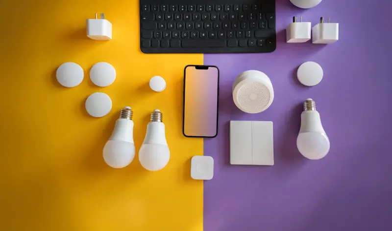
Revamp Your Home with Smart Lighting Hacks for Mood & Savings
A practical guide to using smart lighting for better mood, sharper focus, and lower bills, featuring easy upgrades, tech tips, and design tricks for any home....Read More
Cultivating a Plant‑Infused Reading Nook: A Green Escape for Book Lovers
Discover how to blend books and foliage to craft a tranquil, stylish reading nook that nurtures both mind and plants, complete with lighting tips and DIY plante...Read More

Turning Your Backyard into a Productivity Oasis
A garden desk isn’t just furniture—it’s a lifestyle upgrade that merges work, wellness, and home harmony. Learn to craft a backyard oasis that fuels produ...Read More
0 Comments
Post Comment
You will need to Login or Register to comment on this post!