
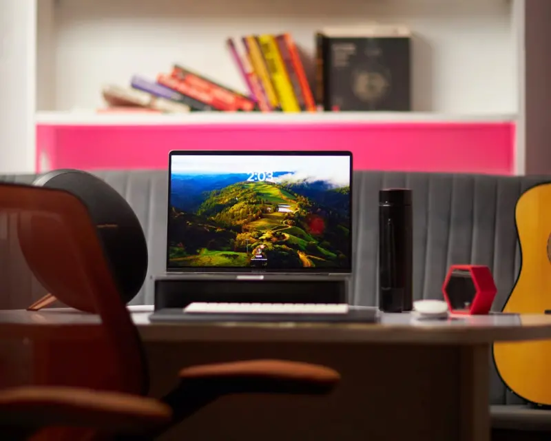
Ever stare at the blank wall behind your monitor and feel a subtle knot tighten in your chest? That little moment of visual fatigue is more than just a design flaw—it’s a signal that your environment is speaking directly to your mental state. As someone who spends countless hours toggling between video calls, spreadsheet marathons, and creative brainstorming, I’ve learned that the colors and textures that surround us can be powerful allies—or silent saboteurs—when it comes to mental health.
The Hidden Psychology of Color
Scientists have been studying chromotherapy for decades, and the consensus is clear: hue matters. Blue is widely associated with calmness and focus, which is why many productivity tools use soft blues in their UI. Green evokes nature, reducing stress and encouraging a sense of renewal. Meanwhile, yellow can spark optimism but, in excess, may overstimulate and lead to anxiety.
When I first rearranged my home office to incorporate a muted teal accent wall, the change was almost immediate. My afternoon slump evaporated, replaced by a steady, low‑level alertness that lasted through the evening. It wasn’t magic; it was a deliberate use of color to cue my brain for the tasks I needed to accomplish.
Crafting a Color Palette That Works for You
Before you dive into a full‑on makeover, experiment with a simple three‑step palette:
- Base: Choose a neutral backdrop (soft gray, warm off‑white) that won’t compete for attention.
- Accent: Pick one calming hue—blue, green, or a muted lavender—and apply it to a wall, a desk organizer, or a large piece of art.
- Pop: Add a splash of an energizing color (like mustard yellow or coral) in small accessories to keep the environment lively without overwhelming you.
Keep the intensity low; pastel versions of these colors tend to be the most soothing. Bright, saturated tones can be useful for short bursts of creativity but should be used sparingly.
Lighting: The Unsung Partner of Color
Even the perfect palette can fall flat under harsh fluorescent lighting. Natural light is the gold standard—it synchronizes your circadian rhythm, boosts serotonin, and enhances color perception. If natural light is limited, invest in full‑spectrum LED bulbs that mimic daylight. Position your workspace so that light washes over your primary screen without causing glare.
Tip: Use a dimmable lamp with a warm amber hue for late‑evening work. The softer light signals to your brain that it’s time to wind down, reducing the risk of insomnia caused by blue‑light exposure.
Sensory Triggers Beyond Sight
While color is a visual cue, our mental health thrives on a harmonious blend of senses. Pair your visual design with subtle auditory and tactile elements:
- Soundscape: A low‑volume playlist of ambient nature sounds (rain, distant waves) can deepen the calming effect of green tones.
- Texture: A smooth wooden desk or a soft felt mouse pad adds a physical grounding element, reminding your body that you’re anchored in the present.
These layered cues create a multisensory sanctuary that gently nudges your nervous system toward relaxation.
Integrating Your Mental‑Health Dashboard
Designing a space that feels right is only half the battle; you need data‑driven insight to know if it truly supports your well‑being. That’s where a personal mental‑health dashboard comes in. By tracking mood, energy levels, and focus metrics alongside environmental variables (like light intensity and color exposure), you can see concrete correlations.
For example, after a week of logging, I noticed a 15% dip in midday anxiety scores on days when my teal accent wall was visible versus days when I worked from a neutral, color‑free room. Armed with that evidence, I made the accent wall a permanent fixture.
Micro‑Rituals: Simple Practices to Reinforce Your Space
Even the most thoughtfully designed environment can become background noise if you don’t actively engage with it. Incorporate micro‑rituals that reaffirm the purpose of your space:
- Morning Light Check: Open your blinds and take a deep breath, noting the light’s hue. This intentional pause signals the start of a focused day.
- Color Reset: Once a week, replace a small decorative item (like a coaster or a plant pot) with a different shade from your palette. The subtle change keeps your brain alert to the environment’s influence.
- Evening Wind‑Down: Dim the lights, switch to a warm amber lamp, and place a calming scented candle (lavender or sandalwood) on your desk for the final 15 minutes of work.
When Remote Work Meets Mental‑Health Design
Remote professionals often juggle multiple workstations—kitchen tables, coffee shops, shared office spaces. Consistency becomes key. By bringing portable elements of your color strategy (like a compact teal mouse pad or a green‑tinted notebook) wherever you go, you maintain a mental anchor that transcends physical location.
Consider a personal care power‑up kit that includes:
- A small, foldable color‑filter screen for laptop privacy and visual calm.
- Noise‑cancelling earbuds pre‑loaded with your chosen soundscape.
- A pocket‑size journal with a cover that matches your accent color, encouraging reflection aligned with your visual environment.
Digital Declutter Meets Physical Declutter
Clutter isn’t just a visual irritant; it competes for cognitive bandwidth. While a separate piece on digital declutter explores the virtual side, the principle applies to your physical surroundings. A clean desk, organized shelves, and minimal decorative overload prevent the brain from constantly scanning for “what’s next.” Pairing a tidy space with a calming color scheme compounds the benefits, creating a feedback loop of clarity and calm.
Measuring Success: Beyond the Aesthetic
Ask yourself these reflective questions every month:
- Do I feel less anxious when I glance at my workspace?
- Has my productivity (measured by completed tasks or deep‑work intervals) improved?
- Am I more inclined to take short, restorative breaks (like a brief stretch or a breath exercise) because the environment feels inviting?
If the answers tilt toward “yes,” you’ve built a space that does more than look good—it actively supports mental health.
Future‑Proofing Your Mental‑Health Environment
As technology evolves, we’ll see smart lighting systems that automatically adjust hue based on time of day and even your biometric feedback. Imagine a desk lamp that shifts from a calming blue during focus periods to a warm amber as your wearables detect rising cortisol levels, prompting you to pause and breathe.
While we await that seamless integration, the fundamentals remain the same: intentional color, balanced lighting, sensory harmony, and data‑driven iteration. By treating your workspace as a living, breathing extension of your mental health toolkit, you empower yourself to thrive—no matter the workload or the external pressures.
Take the first step today: pick a single color you associate with calm, integrate it into a small aspect of your environment, and observe the ripple effect on your mood. The journey from a chaotic visual field to a sanctuary of focus and serenity starts with one deliberate hue.

Lauren Miller is a true outdoors enthusiast who has found her passion in the trades. When she's not working hard on the job, you can find her writing, camping, fishing, and exploring all that nature has to offer. A dedicated partner to her wife Beth, Lauren loves nothing more than spending quality time together and experiencing the great outdoors side by side.
Related Posts
The Power of Curiosity: A Fresh Path to Mental Well‑Being
Explore how cultivating curiosity rewires the brain for stress resilience, sparks creativity, and bu... Read More

Emotional Hygiene: A Daily Practice for Sustainable Mental Well‑Being
Discover a step‑by‑step emotional hygiene system—micro‑reflection, boundary architecture, an... Read More

Playful Curiosity: Rewire Stress into Creativity
Curiosity isn’t just a hobby; it’s a mental‑health strategy. Learn three practical ways to tur... Read More
Top Posts
Micro‑Habits That Supercharge Your Longevity
David Moore explains how tiny, two‑minute actions—like calf raises while waiting for a meeting or a spoonful of chia in your coffee—compound over time to ...Read More
Beyond the Map: Crafting Stories with Your Senses on the Road
Explore travel as a sensory narrative, using sound, scent, touch, and taste to create lasting stories that enrich every adventure....Read More
Garden Desk Revolution: How My Green Workspace Is Redefining Home & Garden Living
Jimmy Damon reveals how his garden desk blends nature and productivity, sparking a green workspace movement that’s transforming homes, work culture, and the e...Read More
Native Plant Gardens: The Busy Professional’s Blueprint for Effortless Beauty
Learn how to create a beautiful native plant garden that thrives with minimal care, perfect for busy homeowners seeking a low‑maintenance outdoor sanctuary....Read More
0 Comments
Post Comment
You will need to Login or Register to comment on this post!