
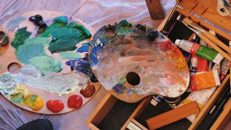
Seeing Mood in Color: A Personal Exploration
When I first painted my living‑room a soft sage green, I didn’t anticipate the subtle shift that followed; the space felt calmer, my mind less crowded, and the evening’s worries seemed to melt into the walls. That unexpected serenity sparked a curiosity that led me down a rabbit hole of research, anecdotes, and countless experiments with hue across my home and wardrobe. Over the past months I’ve learned that color is not just decoration—it is a silent therapist that can coax our nervous system toward balance, boost focus, or even stir a quiet joy that we often overlook in the hustle of daily life. Understanding how color works can become a powerful, low‑cost tool in our mental‑health toolkit.
The science behind color psychology is both elegant and surprisingly robust, drawing from neurology, evolutionary biology, and cultural studies. Certain wavelengths stimulate the brain’s limbic system, influencing neurotransmitters such as serotonin, dopamine, and cortisol; for example, cool blues can lower heart rate and signal safety, while warm reds may increase alertness and energy. Researchers have observed that exposure to specific shades can affect cognitive performance, reduce anxiety, and even improve sleep quality, tying directly into the emotional states we experience day to day. While individual responses vary, the underlying mechanisms suggest that intentional color choices can nudge our mood in predictable ways, offering a subtle yet measurable boost to mental wellbeing.
Before you rush to the paint aisle, start with a simple color audit of the spaces you inhabit most. Walk through your home and note the dominant hues in each room—are they muted neutrals, bold primaries, or a mix of earthy tones? Pay attention to how you feel in each area; a kitchen bathed in bright yellow may inspire optimism, whereas a bedroom painted deep navy might foster restful introspection. Write down these observations alongside a quick rating of your mood in each space, then identify one or two rooms where the palette feels out of sync with the emotions you’d like to cultivate. This brief exercise provides a clear roadmap for targeted adjustments without overwhelming you with a full‑scale redesign.
Armed with your audit, begin with incremental changes that align color with the mental state you wish to support. A splash of teal on a single accent wall can introduce calm without a full renovation, while swapping out throw pillows for shades of coral or amber can inject energizing warmth into a neutral setting. Consider integrating natural elements—such as wooden furniture or plant pots—in hues that echo the outdoors, reinforcing a biophilic connection that research links to reduced stress. Even small details like a turquoise coffee mug or a lavender‑tinted lamp shade can serve as visual anchors, reminding your brain of the desired emotional tone each time you encounter them.
Lighting works hand‑in‑hand with color, amplifying or muting its psychological impact, which is why I turned to lighting hacks to boost mood, focus, and home harmony for the next phase of my experiment. Warm, diffused lighting can soften the intensity of bright reds, making them feel more inviting, while cooler, brighter illumination can enhance the crispness of blues, sharpening concentration. By adjusting bulb temperature, placement, and intensity, you can fine‑tune the ambiance to complement your chosen palette, creating a synergistic environment that supports mental clarity, relaxation, or motivation as needed throughout the day.
Beyond walls and furniture, the colors you wear act as a mobile extension of your emotional environment, influencing both self‑perception and social interaction. Dressing in soothing pastels on a stressful workday can signal calm to your nervous system, while a bold splash of orange during a presentation may convey confidence and enthusiasm to both yourself and your audience. Experiment with layering—perhaps a neutral base accented by a vibrant scarf or a pair of teal sneakers—to keep the effect subtle yet effective. The key is to align your wardrobe’s chromatic choices with the inner tone you aim to nurture, turning daily dressing into a mindful ritual that reinforces mental resilience.
Color also finds a therapeutic home within structured art‑based interventions, where clients use hue intentionally to express and process complex emotions. In art therapy sessions, choosing a palette that reflects one’s current state can serve as a visual diary, offering therapists insight into underlying feelings that may be difficult to articulate verbally. Moreover, the act of mixing paints or selecting colored pencils engages the brain’s reward pathways, fostering a sense of agency and creative flow that combats depressive rumination. Integrating color‑focused exercises into regular self‑care routines—whether through doodling, collage, or digital design—provides a portable outlet for emotional exploration without the need for specialized equipment.
One of the most powerful practices I’ve discovered combines color visualization with breath work, creating a dual‑sensory anchor that deepens relaxation. While practicing the healing power of breath, I imagine inhaling a soothing shade—like a cool sky‑blue—and exhaling a tense hue—such as a heavy, stormy gray—effectively painting my internal landscape with each breath cycle. This simple yet vivid technique leverages the brain’s capacity for imagination to reinforce the physiological benefits of controlled breathing, amplifying calm, reducing anxiety, and sharpening focus. By pairing the rhythmic cadence of breath with the visual cue of color, you create a multisensory loop that trains the mind to associate specific shades with desired emotional states.
To truly gauge the impact of color on your mental health, treat the process as an ongoing experiment rather than a one‑off makeover. Keep a journal documenting mood fluctuations, energy levels, and stress markers as you introduce new hues into your environment and attire. After a few weeks, compare these notes against your baseline to identify patterns—perhaps you notice deeper focus on days you’ve surrounded yourself with soft greens, or a lift in optimism after incorporating sunny yellows into your morning routine. This reflective practice not only validates the effectiveness of your color choices but also empowers you to make data‑driven adjustments, turning the aesthetic of your surroundings into a dynamic ally in your mental‑wellness journey.

Laura Wilson is a freelance writer specializing in the dynamic and ever-evolving field of health. With a passion for translating complex medical information into accessible and engaging content, Laura brings a wealth of knowledge and a fresh perspective to topics ranging from preventative care and nutrition to cutting-edge research and innovative treatments.
Related Posts
Turning Everyday Moments into Mental Health Boosters
Learn how to transform routine moments—quick journaling, short stair climbs, and sensory cues—in... Read More
Rewiring Resilience: A Fresh Blueprint for Mental Health in a Hyper‑Connected World
In the age of relentless digital connectivity, traditional wellness tactics fall short. This article... Read More
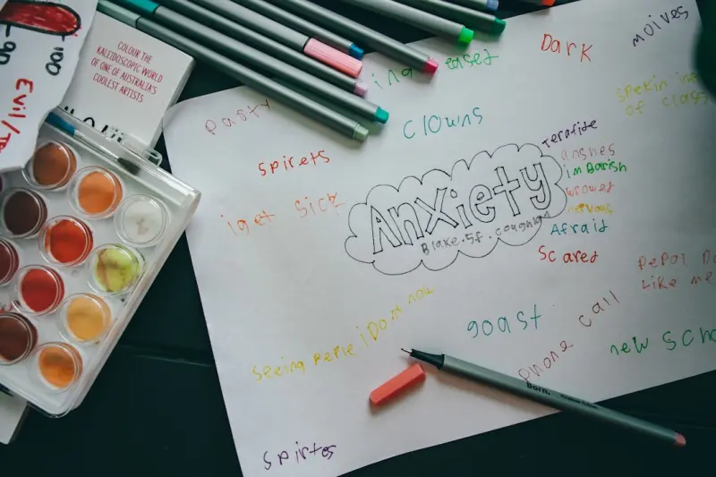
Playful Creativity: A Surprising Antidote to Anxiety
Learn why integrating playful creativity into your routine can reduce anxiety, improve mood, and str... Read More
Top Posts
Playful Pause: How Analog Games Rewire Your Brain for Better Mental Health
A fresh look at mental wellness: using tactile, screen‑free games to reset the brain, foster connection, and strengthen emotional agility....Read More
Why Your Backyard Needs a Garden Desk Now
Explore the rise of garden desks and how they blend work, nature, and design to create a vibrant, productive outdoor oasis for modern living....Read More

Sensory Travel: A Journey for All Five Senses
Explore the practice of sensory travel, a method that engages all five senses to deepen memory, boost creativity, and provide a mental reset, offering travelers...Read More

Skill-Based Hiring Beats Degrees
Explore the rise of skill‑based hiring, learn to turn personal projects into career assets, and see how micro‑internships and digital badges are reshaping e...Read More
0 Comments
Post Comment
You will need to Login or Register to comment on this post!